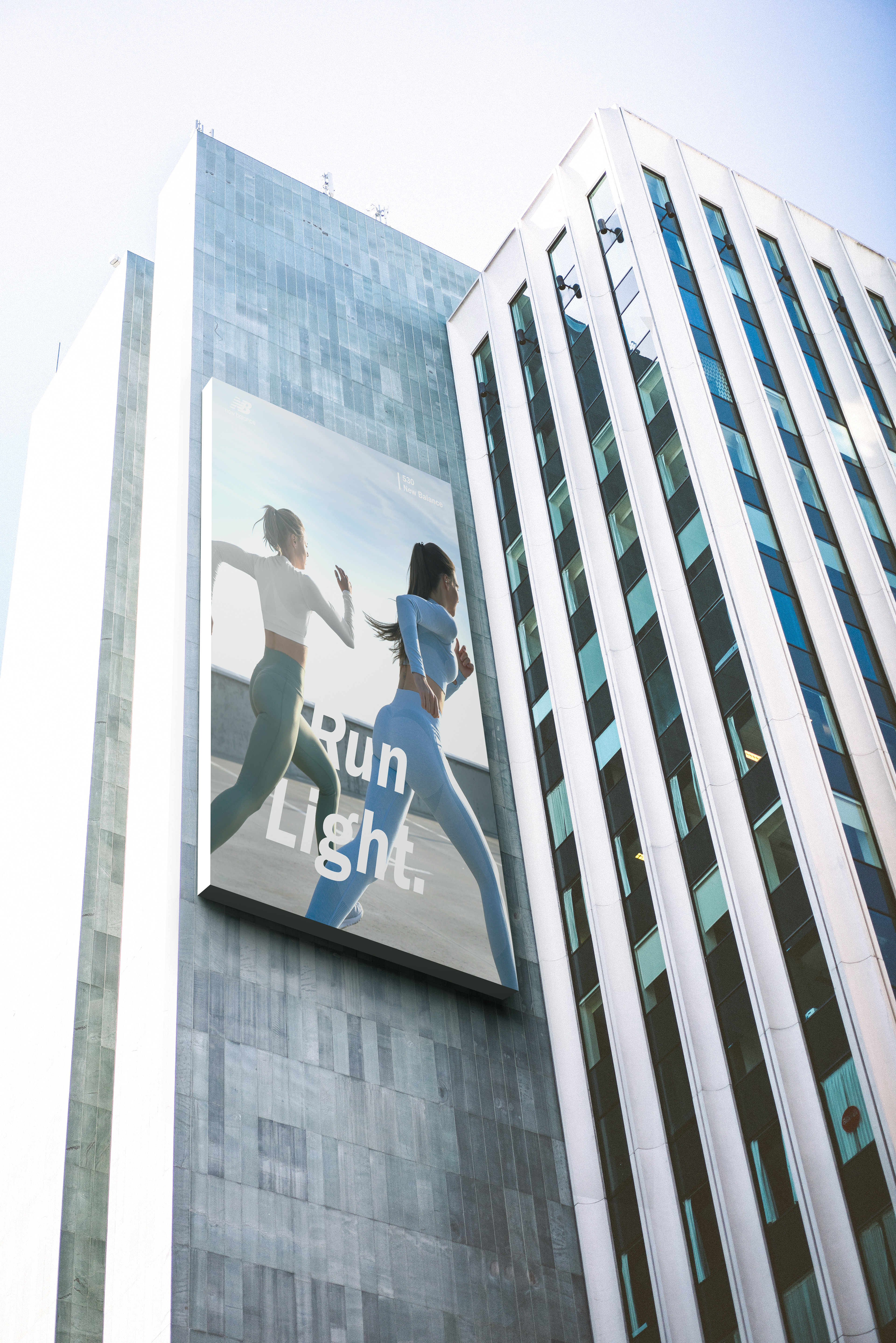
Goal
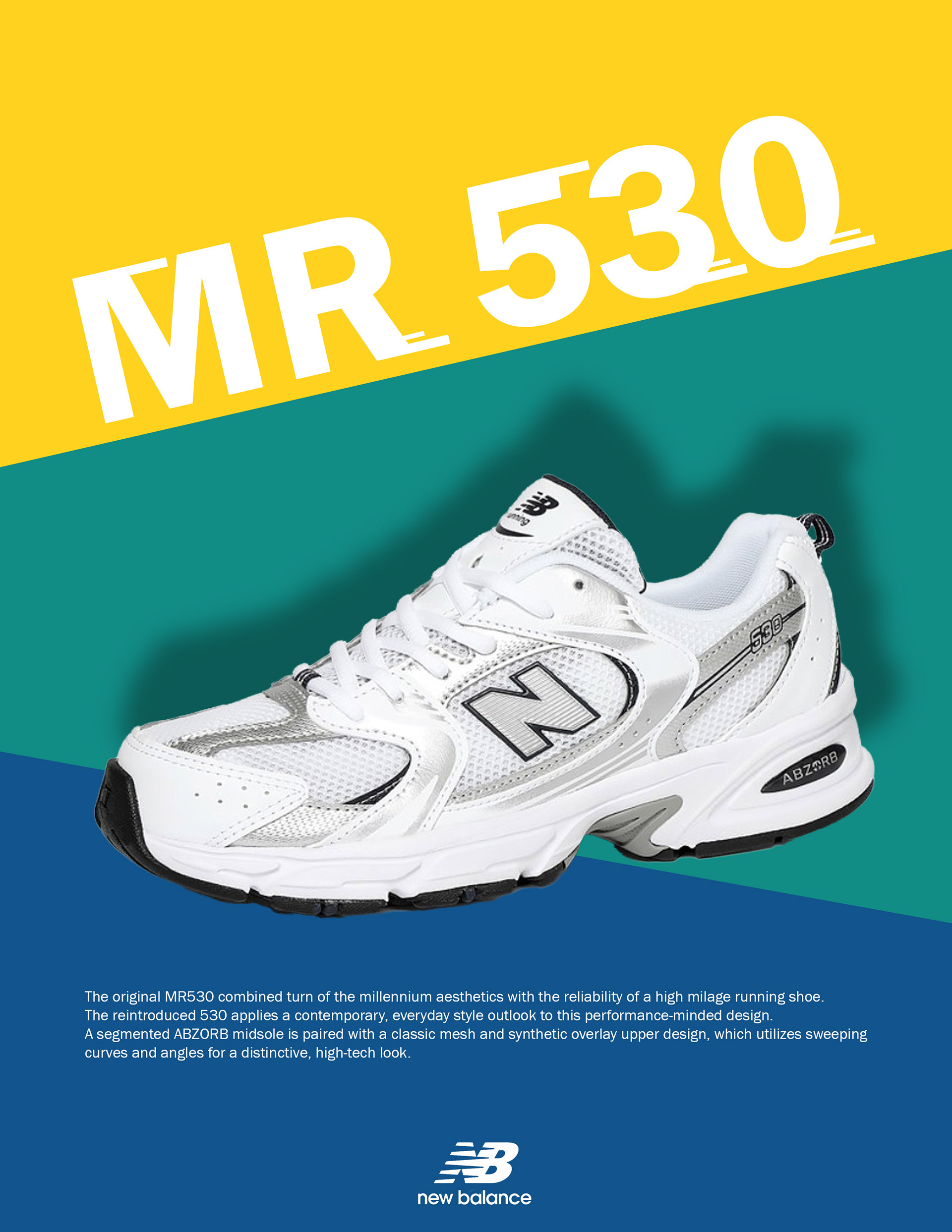
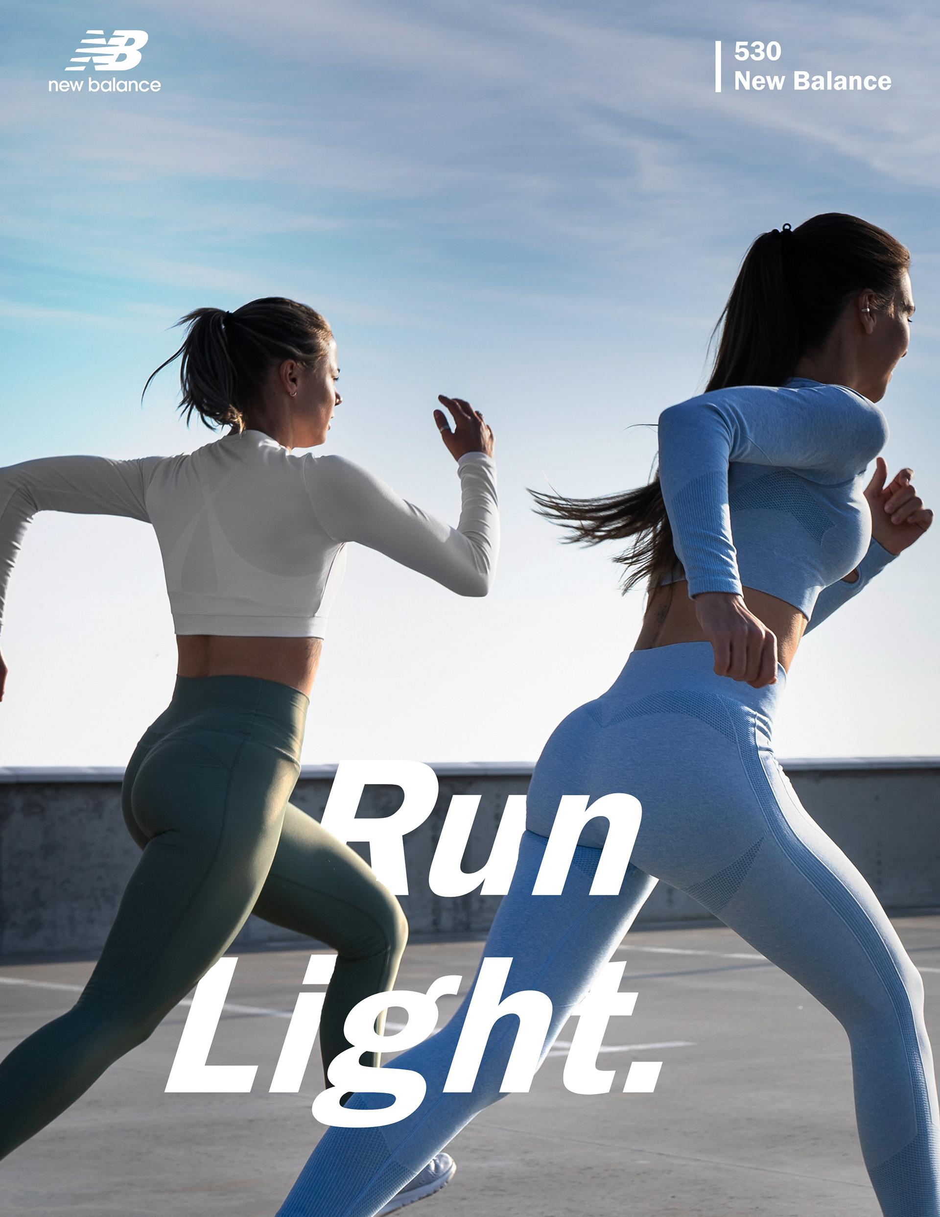
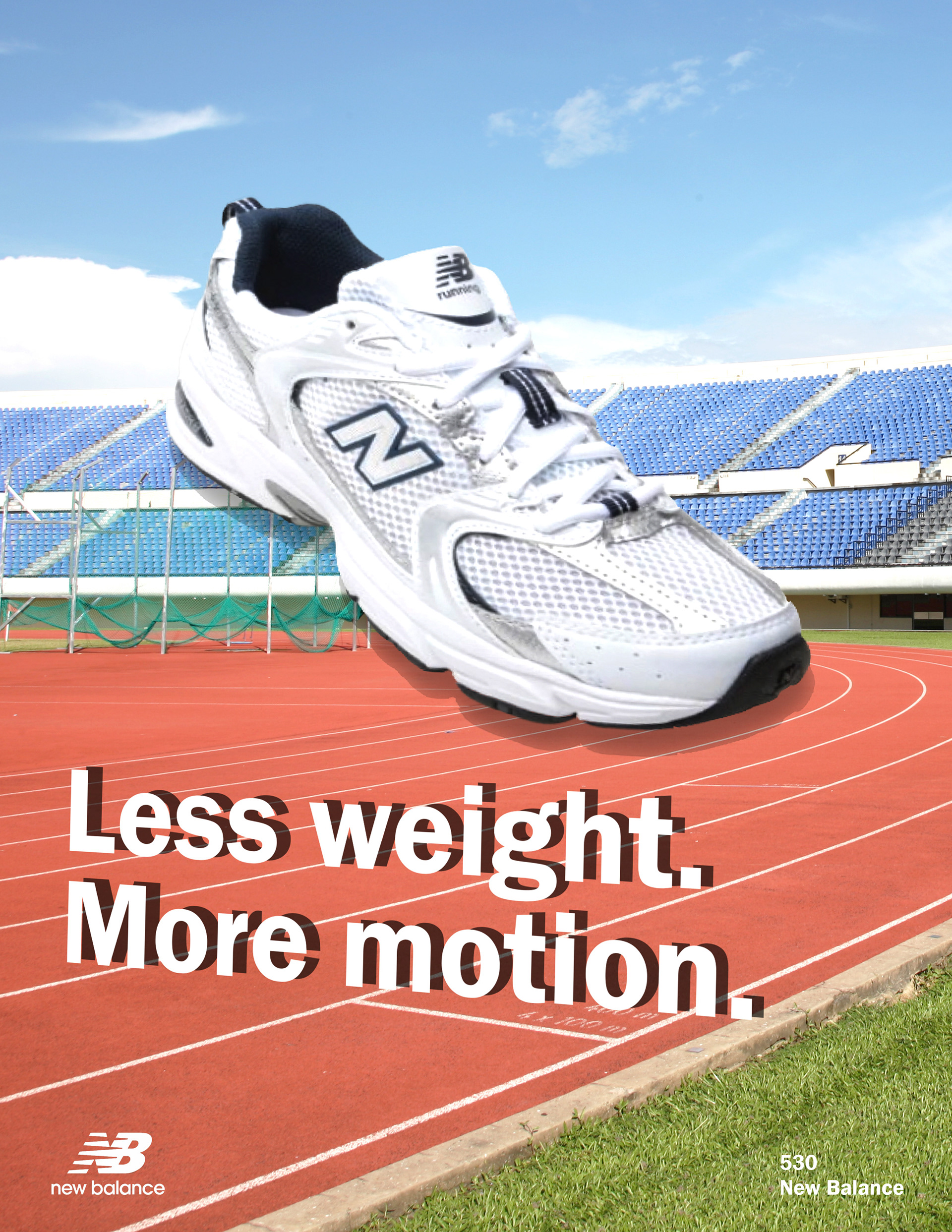
The New Balance 530 blends retro running aesthetics with modern performance, but its identity as a functional running shoe has often been overshadowed by its popularity as a fashion item. This poster was designed to reframe the 530’s image—highlighting its lightweight build, cushioning, and stability to reinforce its technical value.
Problem Statement
Consumers perceived the 530 more as a fashion item than a functional athletic shoe. Existing visuals lacked clarity in communicating movement, energy, and technical value.
Expected outcome
The project aims to reposition the New Balance 530 as a reliable running shoe that also offers aesthetic versatility, appealing to both performance-driven and style-conscious consumers. It also seeks to reinforce New Balance’s brand identity as one that seamlessly blends innovation with heritage.
Design Rational
The color palette—FFD21E, 118C85, and 11548C—was selected to reflect New Balance’s energetic and modern identity. Yellow adds vibrancy and draws attention, while teal and navy provide balance and evoke trust and stability, aligning with the brand’s performance heritage.
Franklin Gothic was chosen for its bold, geometric structure that ensures high readability across formats. Its clean yet assertive tone complements the poster’s dynamic layout.
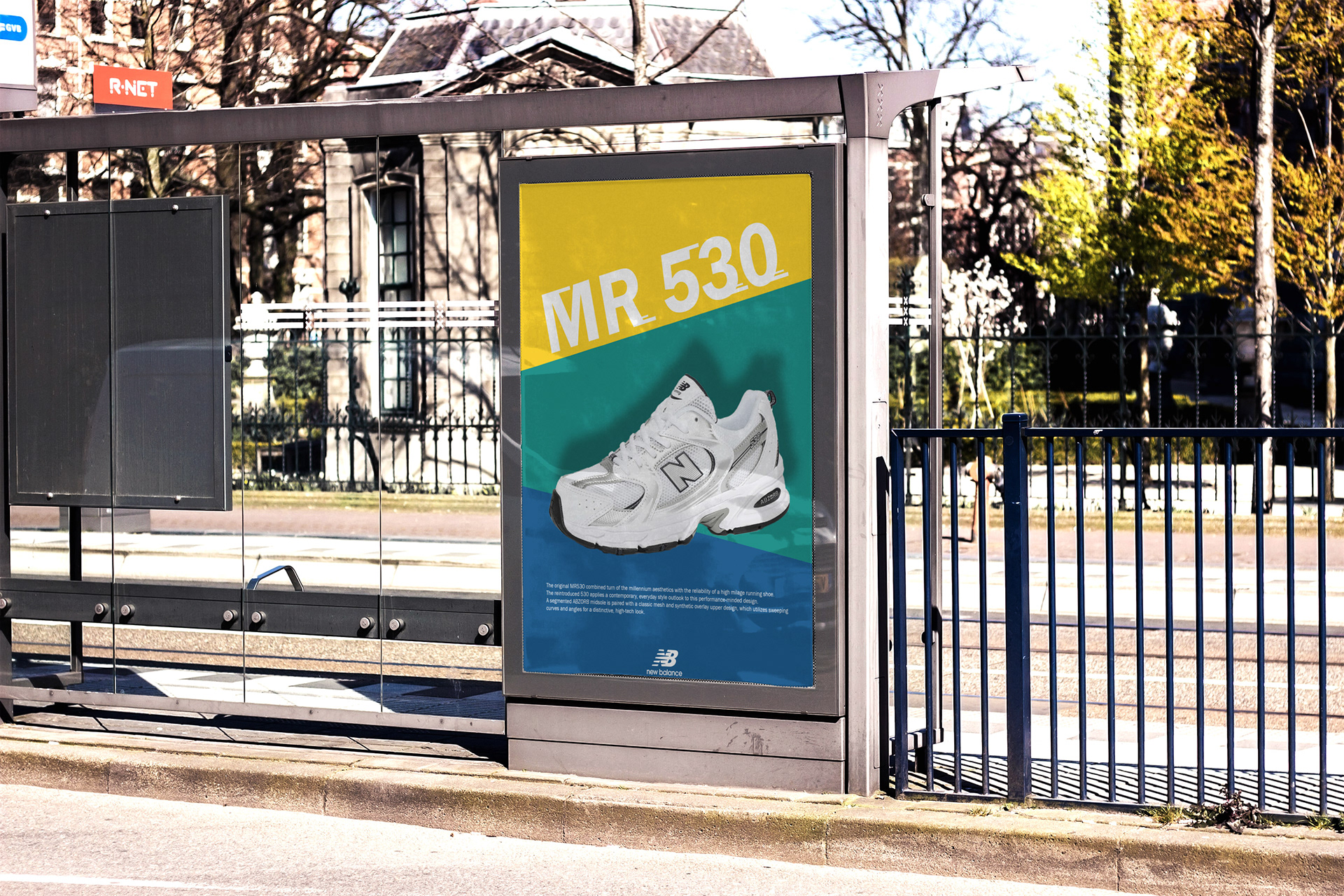
The layout was designed to guide the viewer’s eye through key product features using layered typography and directional flow. To visually express speed and motion, dynamic lines were incorporated throughout the composition—echoing the rhythm of running and reinforcing the shoe’s athletic identity. Shadows and depth were applied to create spatial contrast, enhancing the dimensionality of both text and imagery.