Cafe Application
Goal
The main purpose is to enable users to access café services quickly and conveniently.
To achieve this, the app aims to maximize customer convenience by eliminating the initial login process
and offering an online ordering feature.
To achieve this, the app aims to maximize customer convenience by eliminating the initial login process
and offering an online ordering feature.
Problem Statement
Bliss café application users currently face inconvenience due to complex login steps and the lack of online ordering options. The login process increases the barrier to using the app, and the inability to order online makes it difficult for users to conveniently purchase beverages, thus hindering time savings.
Expected outcome
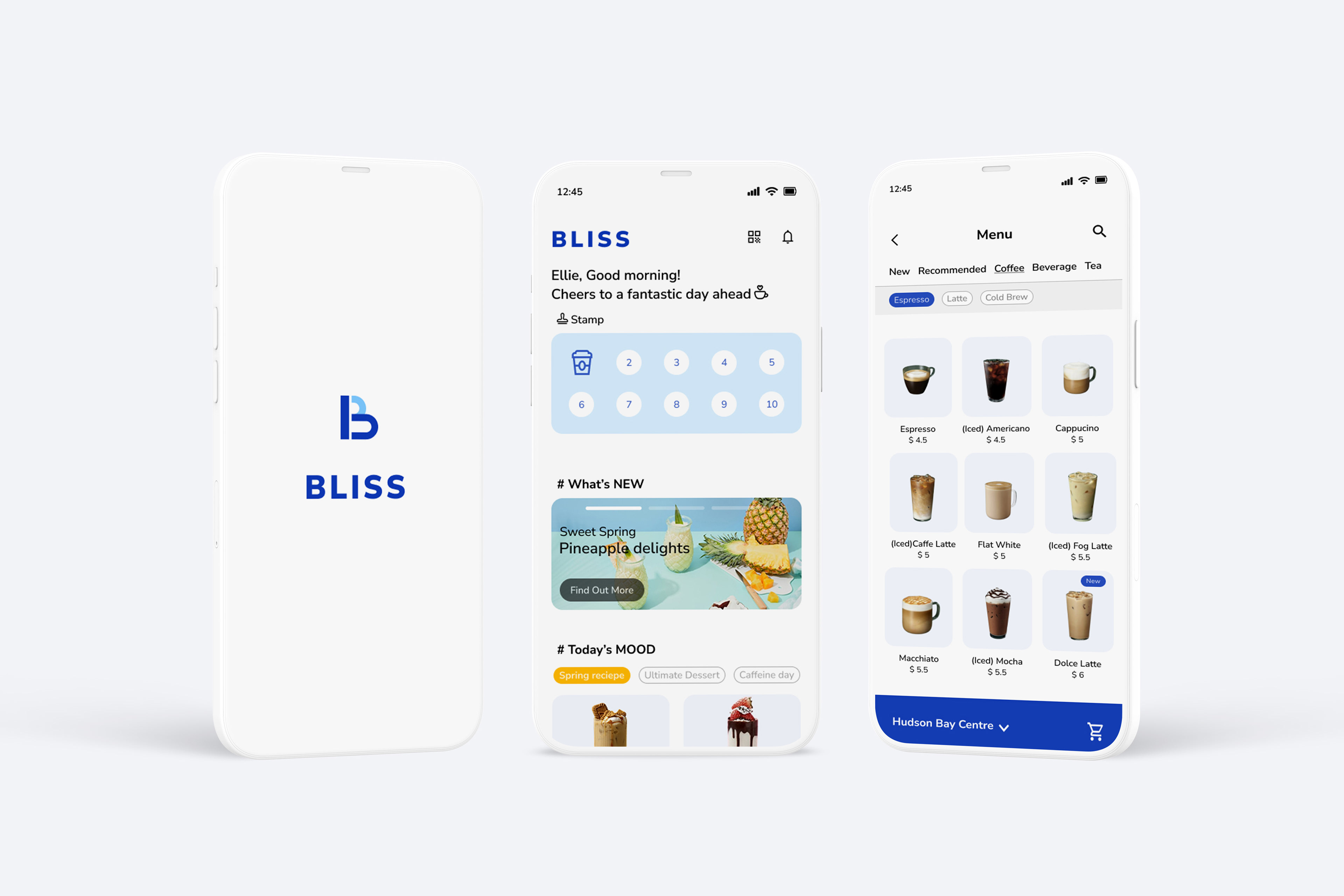
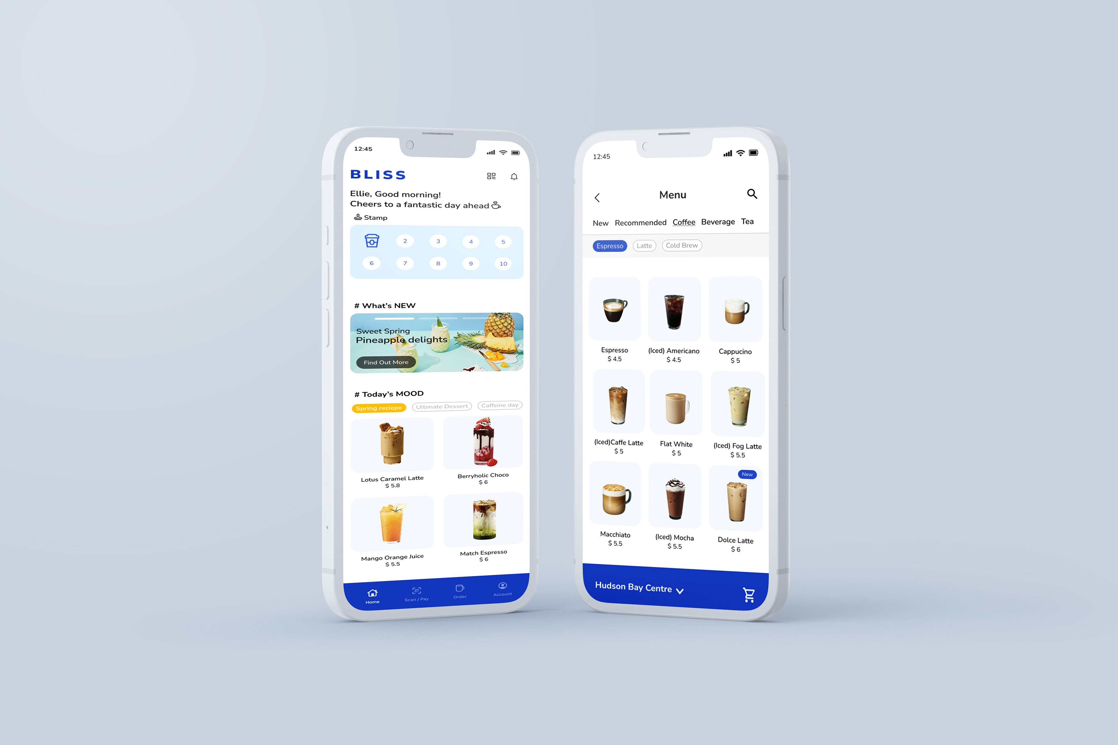
Immediate Access to Home Screen:
Removing the login step allows users to enter the app right away. This reduces friction, speeds up access to key features, and supports more casual and frequent app usage.
Removing the login step allows users to enter the app right away. This reduces friction, speeds up access to key features, and supports more casual and frequent app usage.
Clear and Direct Main Page Structure:
The home screen layout highlights the stamp card, current promotions, and recommended drinks. This provides users with quick visual cues and helps them understand what they can do without needing extra navigation.
The home screen layout highlights the stamp card, current promotions, and recommended drinks. This provides users with quick visual cues and helps them understand what they can do without needing extra navigation.
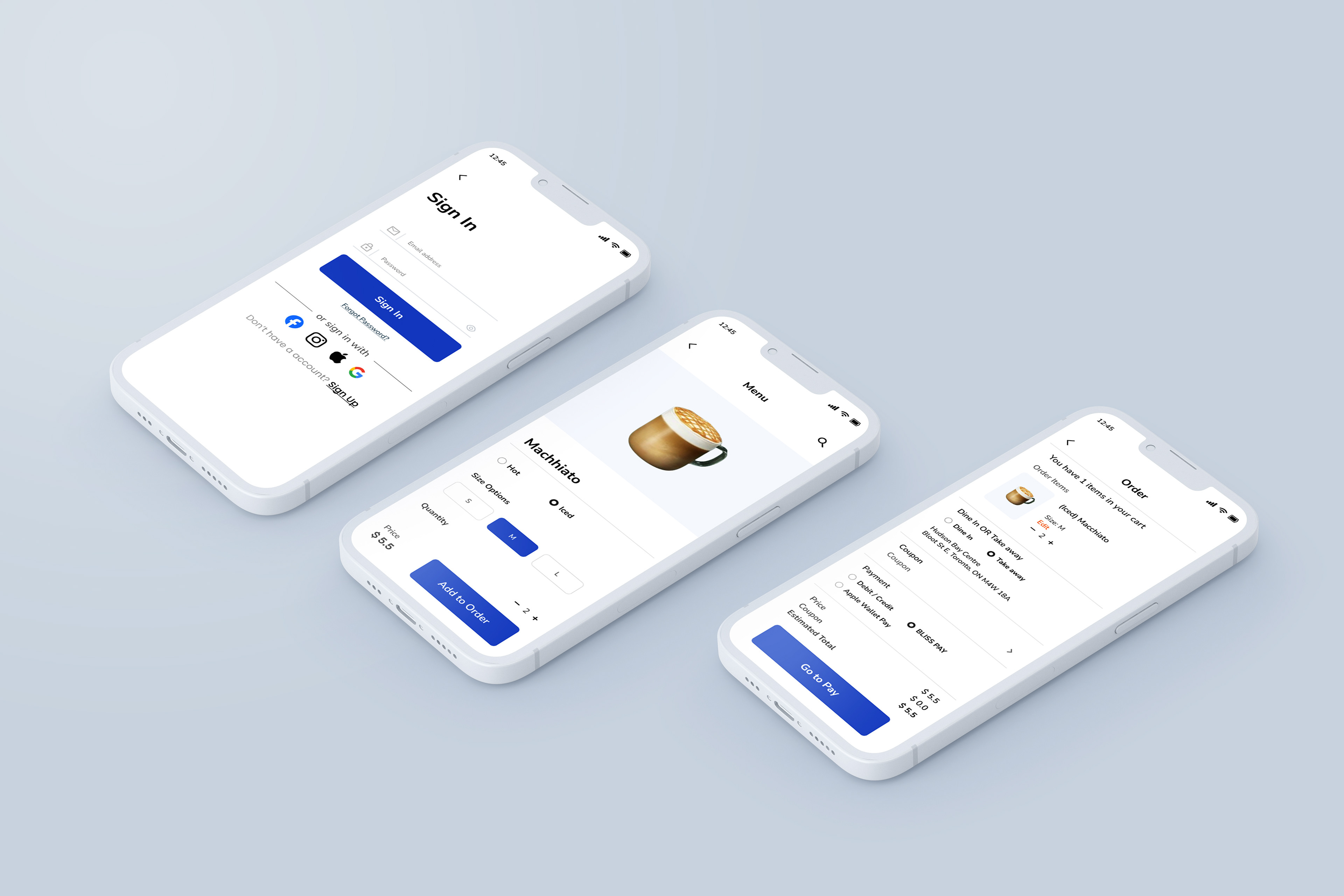
Integrated Online Ordering:
Adding an online order function enables users to place drink orders in advance. This shortens wait times and improves convenience, especially during busy hours.
Adding an online order function enables users to place drink orders in advance. This shortens wait times and improves convenience, especially during busy hours.
Design Rational
This design applies #FFFFFF, #143EBA, #F3F6FD, and #7FC9FF to create a clean and light visual mood.
The deep blue (#143EBA) anchors the interface and highlights key actions, helping users know where to tap.
Meanwhile, #FFFFFF and #F3F6FD provide space and reduce visual clutter, making the layout easy to scan at a glance.
The deep blue (#143EBA) anchors the interface and highlights key actions, helping users know where to tap.
Meanwhile, #FFFFFF and #F3F6FD provide space and reduce visual clutter, making the layout easy to scan at a glance.
For the typography, Nunito Sans was selected for its clear readability and subtle, rounded character.
Distinct weight contrasts were applied to establish a clear hierarchy, allowing users to recognize levels of information at a glance. This typographic approach is intended to support the interface content rather than compete with it visually, ensuring that text remains functional, natural to read, and quietly cohesive within the overall layout.
Distinct weight contrasts were applied to establish a clear hierarchy, allowing users to recognize levels of information at a glance. This typographic approach is intended to support the interface content rather than compete with it visually, ensuring that text remains functional, natural to read, and quietly cohesive within the overall layout.
The layout was structured so that users can access key features as soon as the app opens. Frequently used elements such as the stamp card, promotions, and recommended menu items are placed at the top of the home screen to minimize navigation steps and prevent hesitation about where to tap. In contrast, pages that express the brand’s seasonal mood or promotional visuals are given more space and imagery, allowing the brand’s tone to come through naturally. As a result, the home screen focuses on speed and usability, while the detailed pages provide room for atmosphere and brand expression.